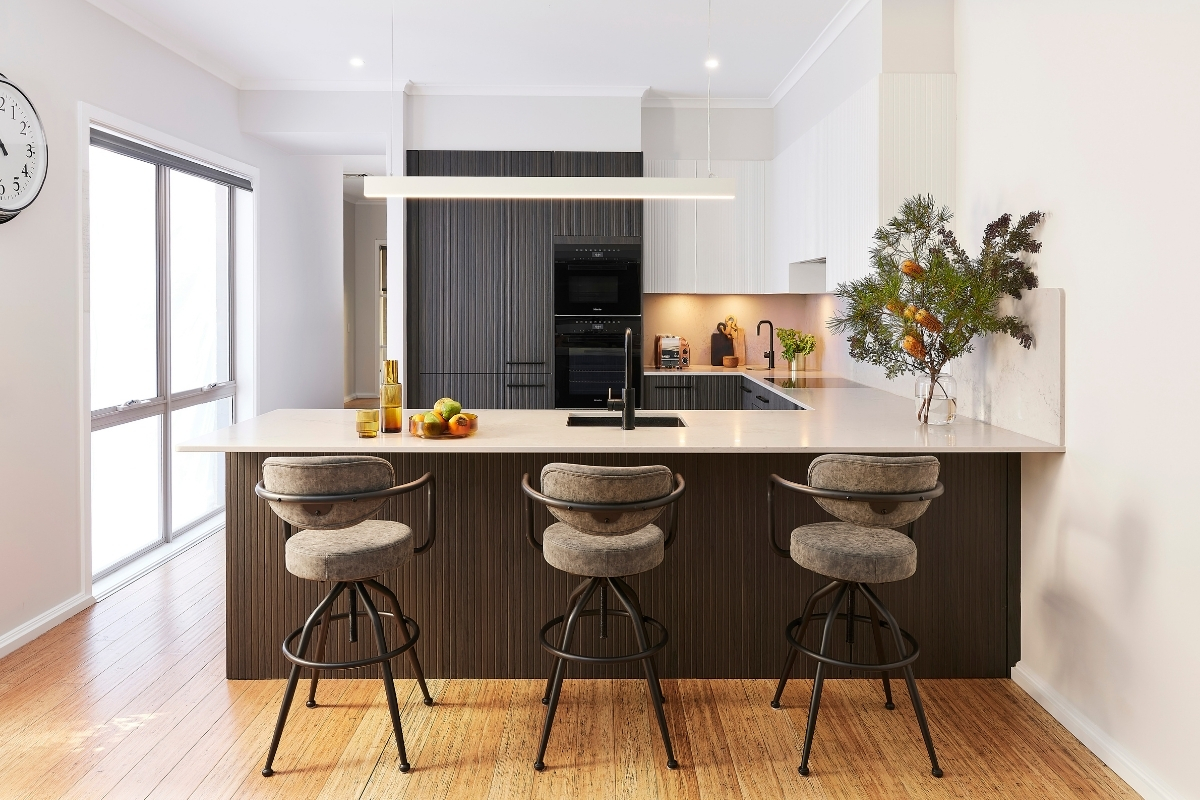
When homeowners Marian and John purchased a perfect home for their family several years ago in Newington, Sydney, they couldn’t overlook the fact that their kitchen was less than perfect. Excited to bring their style to life by creating a modern Industrial-inspired space that allows them to cook and entertain, they called upon Kinsman to help make this a reality. The result is a warm and inviting space that is both stylish and functional.
Read on to learn more about Marian and John’s journey with Kinsman.
Who lives here? Homeowners Marian and John, and their children.
The Problem? The existing kitchen was very narrow, meaning only one person could be using it comfortably at any given time. Blind corners within the U-shaped layout meant items were difficult to access, and a small pantry was not suitable for a growing family. A lack of storage and seating area was another big drawback for them as home owners who love to entertain, the ability to bring family and friends together was a must!
The Brief. To create a stylish and functional kitchen that ticks all the boxes for the family. “We knew we wanted a large servery area for entertaining and space to sit at the bench with plenty of legroom, explains Marian. We also wanted to bring in warmth from wood in a darker tone for our joinery with a lighter coloured benchtop for a modern yet inviting look.”
The Solution.
Part 1. The Style & Colour Palette.
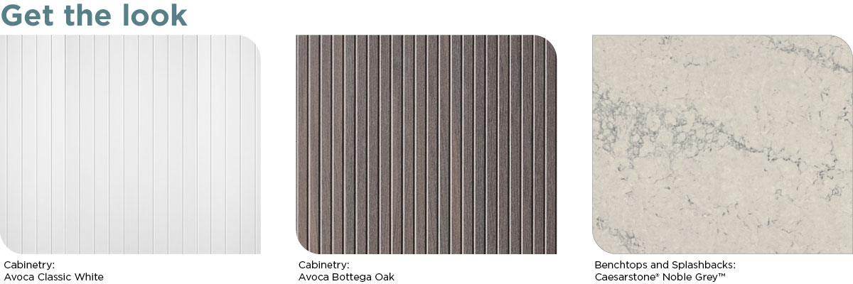
To complement the rest of the home and the couple’s style, a chic Industrial look was created with a palette of white, warm timber and light grey marble. Existing bamboo flooring needed to be considered when selecting the timber tones for the joinery and Bottega Oak, with its warmth and depth pairs beautifully with the lighter hues of the bamboo.

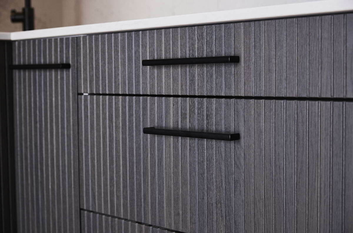
Instead of selecting flat profile doors throughout the space, Avoca cabinetry in both Classic White and Bottega Oak, shines. New to our range, Avoca is a decorative and vertically fluted door profile available in a modern matte finish. This addition adds texture and depth to the kitchen, and the inclusion of black handles, tap and appliances further enhances the scheme.
Part 2. The Layout
We worked with the kitchens existing U-shaped layout but reimagined the old design to create one that works hard, ensuring that every inch of space is easy to use and access, and allows appliances to be placed within easy reach of each other.
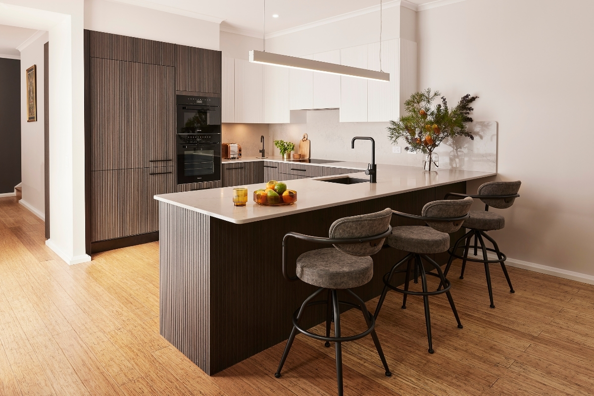
U-shaped kitchens are the perfect choice for busy households that love to spend time in the kitchen. Made up of three walls featuring cabinetry, appliances and benchtops that are all joined to resemble a ‘U’ shape, one downfall of this layout is pesky corner cabinets that are tricky to access. Our Corner Carousels offers a great solution- providing easy access to these areas that are otherwise impossible to reach. LED Downlights have been placed under wall cabinets to ensure bench space beneath is well-lit, ensuring prep is easy and safe.
Part 3. Benchtops & Splashbacks
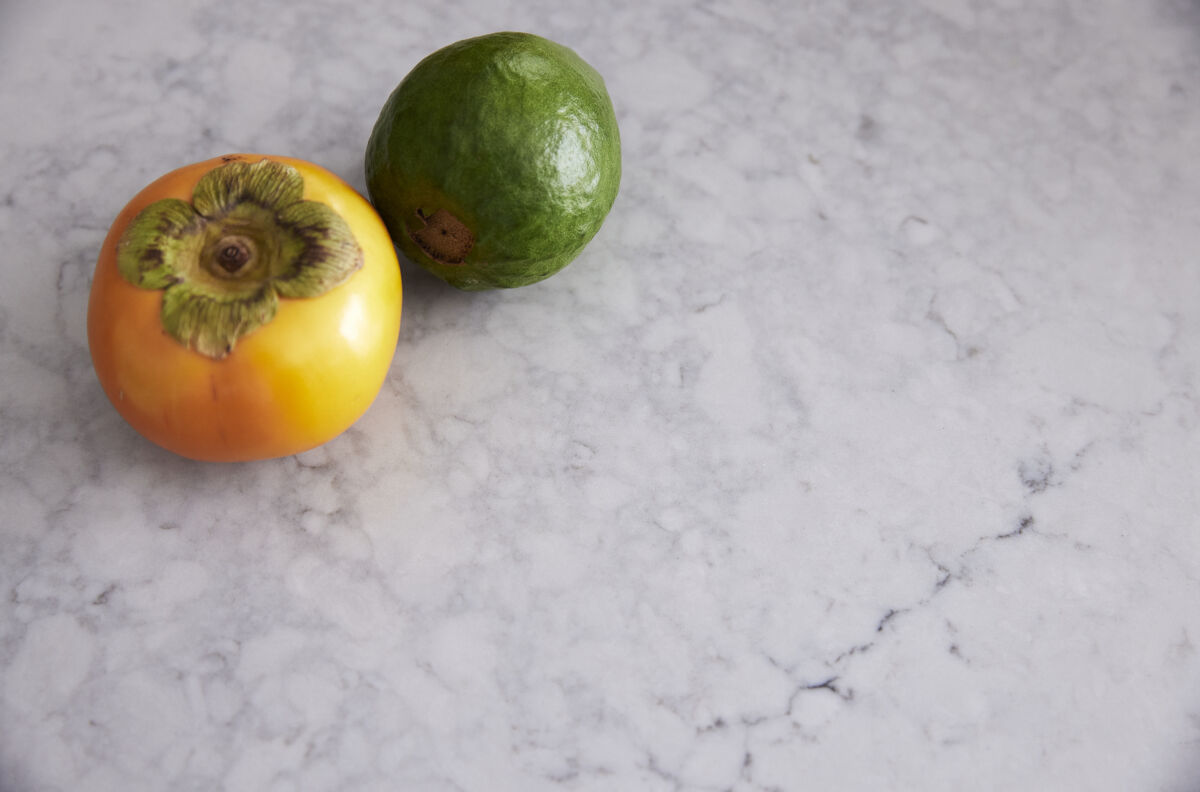
One of the advantages of a U-shaped kitchen is the bench space it creates – perfect for both cooking prep as well as plenty of room to allocate seating. Benchtops in Caesarstone® Noble Grey offer a polished light grey base with a luxurious blend of dark grey veining and creamy white hues that have been brought up onto the splashback for a sophisticated look.
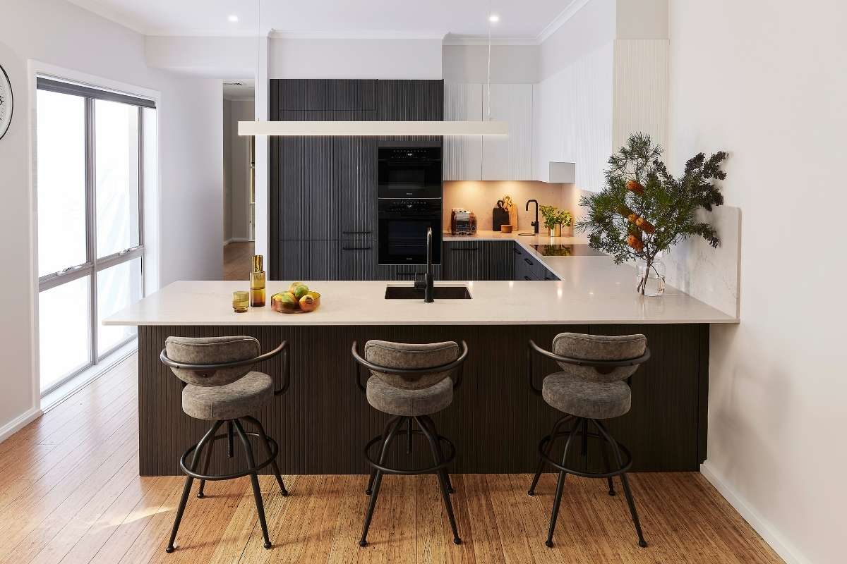
The principal bench space at the front of the kitchen spans more than 3 metres and includes an overhang, creating a casual seating/dining area. This servery space is now the gathering place for the family throughout the day and allows Maria and John to chat and interact with their guests when preparing or serving food in the kitchen. The rounded edges of the island soften the look while still looking refined.
Part 4. Storage
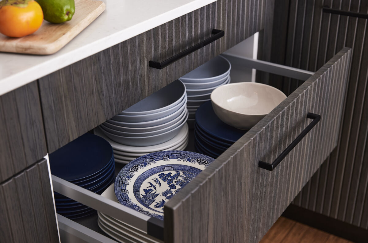
The original kitchen lacked storage in part due to a disproportionate inclusion of cupboards over drawers as well as blinds spots in the corner cupboards- which have been solved with Kinsman’s corner carousels. The new design now offers a mixture of both cabinets and drawers, allowing for easier storage and access to frequently used items such as crockery and larger items such as pots and pans. The upper wall cupboards above the cooktop provide the perfect place for glassware. A larger pantry has been included in the design, ensuring that another ‘must have’ inclusion can be ticked off the list!
Part 5. Appliances
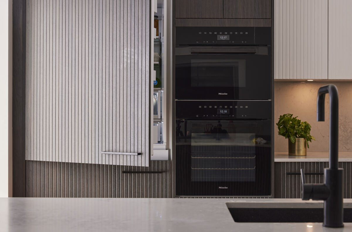
A mixture of integrated, semi-integrated and exposed appliances feature in the new design- all selected specifically by Maria and John to make cooking and entertaining a joy. A Fisher & Paykel 525L Integrated ActiveSmart™ Bottom Mount Fridge is concealed behind Avoca Bottega Oak doors, while a semi-integrated Miele dishwasher sits to the right of the sink & tap on the inside of the island bench. Beside the fridge, there is not one but two ovens stacked on top of each for a sleek look. An induction cooktop and undermount rangehood also feature, adding to the streamlined design.
The Result.
The new kitchen delivers style and functionality in spades! The thoughtful design, modern colour palette, Avoca joinery, and smart storage solutions create a stylish and timeless kitchen. When asked about her favourite part of the kitchen, Marian can’t pick just one! “Our appliances are amazing, but the wide benchtop where we can sit and eat and use as a servery is also fantastic!’ she says.
Inspired to create your very own perfect kitchen with us?
Book your in-store, in-home or virtual appointment HERE. For more inspiration, ideas and images, download the latest copy of our Ideas & Inspiration Catalogue HERE.
Full kitchen details.
Cabinetry: Avoca Classic White
Cabinetry: Avoca Bottega Oak
Benchtops and Splashbacks: Caesarstone® Noble Grey
Handles: By client (for similar, consider Kinsmans Black Anodised Bars), Touch Catch
Kickboards: Matching Accessories: Corner Carousel, Cutlery Tray, Ninka Bin
Lighting: LED Downlights. Pendant light is the clients own.
Tap: By client Sink: Oliveri Santorini Undermount
Appliances: Miele. Fridge from Fisher & Paykel
Photography: Patrick Moran
Styling: April Sharratt


